Well, I think it safe to say that one map is not for all people nor is one map for all mediums. Take, for example, this AT&T World Internet Topology map below
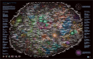
Static, incredibly detailed, but not for the faint of bandwidth. In fact, with a pretty decent internet connection, it took just over 2 minutes to load the pdf at 100% on my computer and in the chip below, you see how much detail they’ve thrown into it.
 I think it could be argued that maybe a map such as this should be more of a web-based sort of map so the user could interact as much or as little as desired. As far as within a blog post, I think what I’ve done here with static images is probably about as far as this map would travel. This is best viewed in its entirety outside of a blog post.
Now the National Geographic, they do maps right. They’ve even got a great interactive web map that puts data at your fingertips. This map, or really, series of maps, is best with this web interface as it allows the user to turn on multiple layers of data. Should this data be static, it would require the person to look at the maps one at a time and then try to draw correlations. While this web-based map is awesome in its own right, it’s not really made to be within a blog and would likely only distract the reader from the topic, unless that topic is about this map.
When looking for a second web-based map that could work in a blog, I came across this interactive map of air-pollution at The Atlantic. This is a short and sweet interactive map that has a very concise subject and is easy to use. This simple web map is best for a blog as it will enhance the topic of the blog (assuming it’s about air-pollution) instead of sucking you in to explore more items (National Geographic) and it won’t blow up your machine or phone trying to use the map, like with the static AT&T map.
For grins, I found this additional web map title the “United Steaks of America” by Slate. Once again, without the pop-ups explaining the meaning behind the sometimes less than identifiable icons (had to click on Montana cause I thought I was looking at chicken nuggets – silly me!) this map would be less than useful. But I think that it’d fit well within a blog – once again, a simple map with a single purpose and easy to use.
Finally, a static map this great for a blog post is the Washington Post’s map “Where the world’s people live, by economic status” (first item in the article). Once again, short, sweet and too the point that doesn’t take away from a blog post, but should enhance it.


